
Brooklinen
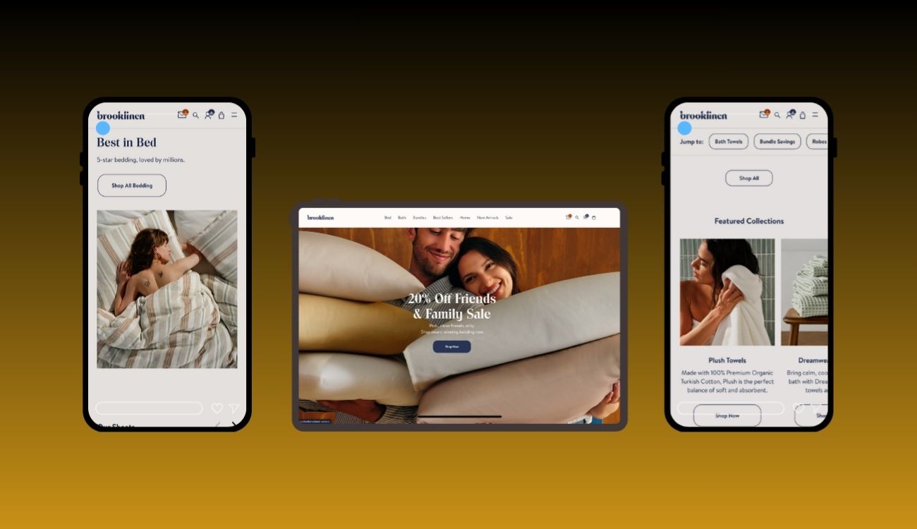
Website with smooth transitions, well-structured product pages, clean design
Problem
Brooklinen, a premium direct-to-consumer bedding and home textiles brand, had a strong brand identity and product offering — but its user interface and experience had friction points that limited maximum conversion, engagement, and ease of use:
Navigation & Product Discovery Friction
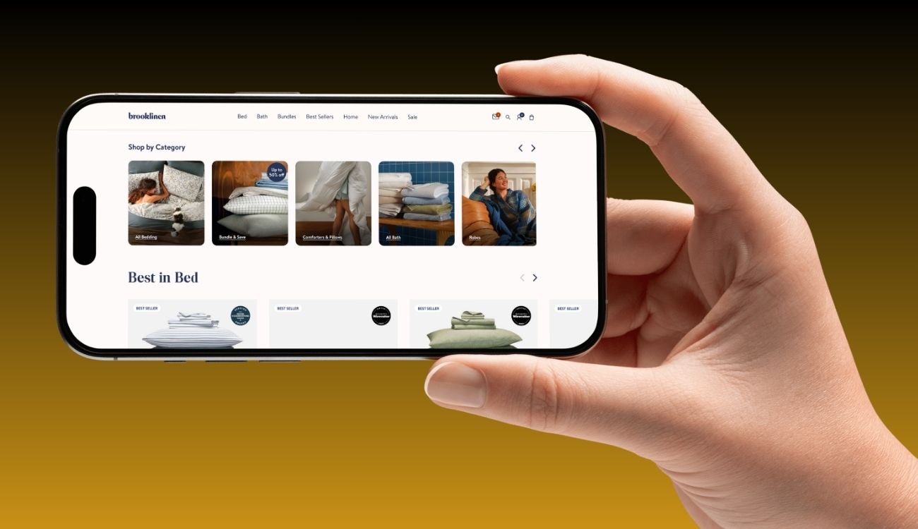
On pages like Best Sellers, the mobile layout used a carousel display that showed ~1.5 products at a time — reducing scanability and burdening users to swipe through many items. (Cheryl AbuMoussa's Portfolio)
Inconsistent UI Patterns Across Pages
Some pages used different layouts, button styles, and interactive behaviors, which diluted brand consistency and confused repeat users.Checkout & Form Usability Weaknesses
As with many e-commerce sites, Brooklinen’s checkout forms and mobile flow risked abandonment due to too many fields, unclear labels, or lack of context. (General best practices warn that mobile checkout forms must maintain context, avoid inline labels that disappear, and minimize steps) (Baymard Institute)Scalability & Design System Gaps
As Brooklinen expanded its product lines, content pages (like blogs, lookbooks) and product pages lacked a unified design system, causing maintainability challenges and inconsistency between marketing and commerce experiences.Underleveraged Qualitative UX Insights
Brooklinen had used session replay tools (reported by Heap) to observe real user flows and friction areas in their site journeys, but needed more structured UI/UX work to translate insights into design changes. (Heap)
These UX/UI constraints limited Brooklinen from fully converting high-intent users, optimizing retention, and scaling new content or product modules with consistency.
Solution
Digital & Designs delivered an end-to-end UX/UI redesign, rooted in user insight, consistency, performance, and modular design. Here’s how we addressed each problem:
1. UX Audit & User Behavior Mapping
Analyzed session replay data and heatmaps to pinpoint friction zones (e.g. interactions in the product grid, drop-off in checkout). (Heap)
Conducted heuristic audits across pages like Best Sellers, product listing pages, blog, and checkout flows to identify inconsistent patterns.
Established user personas and flows (new visitor, returning buyer, upsell buyer) and mapped critical paths (home → product → add to cart → checkout).
2. Design System & UI Consistency
Created a modular design system encompassing reusable components (buttons, cards, form elements, typography, spacing) to enforce consistency across product and content pages.
Standardized interaction behaviors (hover states, micro-animations, feedback) so users have predictable and delightful experiences across sections.
Rolled out responsive versions of components, ensuring layouts adapt elegantly for mobile, tablet, and desktop.
3. Page Redesign & Prototype Testing
Redesigned key pages: Home, Best Sellers, Product Listing, Product Details, Cart & Checkout, and Blog / Editorial.
On Best Sellers, replaced the mobile carousel with a grid view (2-per-row) for easier scanning, allowing more products to be visible without forcing swipes. (Inspired by UX reworks observed in portfolio reviews) (Cheryl AbuMoussa's Portfolio)
Improved form layouts in checkout to place labels above fields (not inline), grouped logical fields, and ensured all labels had self-contained context (e.g. “Billing Phone” instead of just “Phone”).
Built interactive prototypes for usability testing, gathering feedback to optimize flow, CTA placements, and error handling.
4. Performance & Accessibility Optimization
Optimized image assets (responsive formats, compression, lazy loading) and deferred unnecessary scripts to speed up page load, especially mobile.
Audited accessibility: color contrast, keyboard navigation, ARIA labeling, and focus states to ensure inclusive access.
Reduced cognitive load by streamlining hero sections, decluttering layouts, and using white space effectively.
5. Iterative Testing & Post-Launch Refinement
Deployed A/B tests on variant layouts, CTA placements, and header designs across pages like Best Sellers and product listing pages.
Monitored analytics (click-throughs, bounce, conversion funnel drop-offs) and iteratively adjusted UI based on real usage data.
Scheduled periodic design audits to ensure new features or additions remain consistent with system guidelines.
Concepts
Below are the core UX/UI design concepts applied to Brooklinen’s redesign:
Concept | Application at Brooklinen |
Modular Design System | Unified components and patterns ensure consistency across product, editorial, and checkout pages. |
Grid vs Carousel UX | Replacing mobile carousels (especially in product showcases) with grid layouts improves scanability and engagement. (Cheryl AbuMoussa's Portfolio) |
Contextual Form Design | Placing field labels above inputs, self-contained labels, and grouping fields reduce friction in checkout on mobile. (Baymard Institute) |
Performance-First UI | Prioritizing load speed, lazy loading, and minimal scripts ensures UI changes don’t compromise performance. |
Accessibility by Design | Built for inclusive use with keyboard navigation, semantic markup, contrast compliance, ARIA labels, etc. |
Data-Driven Iteration | Using session replay, analytics, and A/B tests to refine UI continuously and ensure real-world impact. (Heap) |
More Works


FAQ
01
What budget should we start with?
02
Do you produce creatives?
03
Can you work with our influencer program?
03
How soon to results?

Brooklinen
Website with smooth transitions, well-structured product pages, clean design
Problem
Brooklinen, a premium direct-to-consumer bedding and home textiles brand, had a strong brand identity and product offering — but its user interface and experience had friction points that limited maximum conversion, engagement, and ease of use:
Navigation & Product Discovery Friction
On pages like Best Sellers, the mobile layout used a carousel display that showed ~1.5 products at a time — reducing scanability and burdening users to swipe through many items. (Cheryl AbuMoussa's Portfolio)
Inconsistent UI Patterns Across Pages
Some pages used different layouts, button styles, and interactive behaviors, which diluted brand consistency and confused repeat users.Checkout & Form Usability Weaknesses
As with many e-commerce sites, Brooklinen’s checkout forms and mobile flow risked abandonment due to too many fields, unclear labels, or lack of context. (General best practices warn that mobile checkout forms must maintain context, avoid inline labels that disappear, and minimize steps) (Baymard Institute)Scalability & Design System Gaps
As Brooklinen expanded its product lines, content pages (like blogs, lookbooks) and product pages lacked a unified design system, causing maintainability challenges and inconsistency between marketing and commerce experiences.Underleveraged Qualitative UX Insights
Brooklinen had used session replay tools (reported by Heap) to observe real user flows and friction areas in their site journeys, but needed more structured UI/UX work to translate insights into design changes. (Heap)
These UX/UI constraints limited Brooklinen from fully converting high-intent users, optimizing retention, and scaling new content or product modules with consistency.
Solution
Digital & Designs delivered an end-to-end UX/UI redesign, rooted in user insight, consistency, performance, and modular design. Here’s how we addressed each problem:
1. UX Audit & User Behavior Mapping
Analyzed session replay data and heatmaps to pinpoint friction zones (e.g. interactions in the product grid, drop-off in checkout). (Heap)
Conducted heuristic audits across pages like Best Sellers, product listing pages, blog, and checkout flows to identify inconsistent patterns.
Established user personas and flows (new visitor, returning buyer, upsell buyer) and mapped critical paths (home → product → add to cart → checkout).
2. Design System & UI Consistency
Created a modular design system encompassing reusable components (buttons, cards, form elements, typography, spacing) to enforce consistency across product and content pages.
Standardized interaction behaviors (hover states, micro-animations, feedback) so users have predictable and delightful experiences across sections.
Rolled out responsive versions of components, ensuring layouts adapt elegantly for mobile, tablet, and desktop.
3. Page Redesign & Prototype Testing
Redesigned key pages: Home, Best Sellers, Product Listing, Product Details, Cart & Checkout, and Blog / Editorial.
On Best Sellers, replaced the mobile carousel with a grid view (2-per-row) for easier scanning, allowing more products to be visible without forcing swipes. (Inspired by UX reworks observed in portfolio reviews) (Cheryl AbuMoussa's Portfolio)
Improved form layouts in checkout to place labels above fields (not inline), grouped logical fields, and ensured all labels had self-contained context (e.g. “Billing Phone” instead of just “Phone”).
Built interactive prototypes for usability testing, gathering feedback to optimize flow, CTA placements, and error handling.
4. Performance & Accessibility Optimization
Optimized image assets (responsive formats, compression, lazy loading) and deferred unnecessary scripts to speed up page load, especially mobile.
Audited accessibility: color contrast, keyboard navigation, ARIA labeling, and focus states to ensure inclusive access.
Reduced cognitive load by streamlining hero sections, decluttering layouts, and using white space effectively.
5. Iterative Testing & Post-Launch Refinement
Deployed A/B tests on variant layouts, CTA placements, and header designs across pages like Best Sellers and product listing pages.
Monitored analytics (click-throughs, bounce, conversion funnel drop-offs) and iteratively adjusted UI based on real usage data.
Scheduled periodic design audits to ensure new features or additions remain consistent with system guidelines.
Concepts
Below are the core UX/UI design concepts applied to Brooklinen’s redesign:
Concept | Application at Brooklinen |
Modular Design System | Unified components and patterns ensure consistency across product, editorial, and checkout pages. |
Grid vs Carousel UX | Replacing mobile carousels (especially in product showcases) with grid layouts improves scanability and engagement. (Cheryl AbuMoussa's Portfolio) |
Contextual Form Design | Placing field labels above inputs, self-contained labels, and grouping fields reduce friction in checkout on mobile. (Baymard Institute) |
Performance-First UI | Prioritizing load speed, lazy loading, and minimal scripts ensures UI changes don’t compromise performance. |
Accessibility by Design | Built for inclusive use with keyboard navigation, semantic markup, contrast compliance, ARIA labels, etc. |
Data-Driven Iteration | Using session replay, analytics, and A/B tests to refine UI continuously and ensure real-world impact. (Heap) |
More Works
FAQ
01
What budget should we start with?
02
Do you produce creatives?
03
Can you work with our influencer program?
03
How soon to results?
Brooklinen
Website with smooth transitions, well-structured product pages, clean design
Problem
Brooklinen, a premium direct-to-consumer bedding and home textiles brand, had a strong brand identity and product offering — but its user interface and experience had friction points that limited maximum conversion, engagement, and ease of use:
Navigation & Product Discovery Friction
On pages like Best Sellers, the mobile layout used a carousel display that showed ~1.5 products at a time — reducing scanability and burdening users to swipe through many items. (Cheryl AbuMoussa's Portfolio)
Inconsistent UI Patterns Across Pages
Some pages used different layouts, button styles, and interactive behaviors, which diluted brand consistency and confused repeat users.Checkout & Form Usability Weaknesses
As with many e-commerce sites, Brooklinen’s checkout forms and mobile flow risked abandonment due to too many fields, unclear labels, or lack of context. (General best practices warn that mobile checkout forms must maintain context, avoid inline labels that disappear, and minimize steps) (Baymard Institute)Scalability & Design System Gaps
As Brooklinen expanded its product lines, content pages (like blogs, lookbooks) and product pages lacked a unified design system, causing maintainability challenges and inconsistency between marketing and commerce experiences.Underleveraged Qualitative UX Insights
Brooklinen had used session replay tools (reported by Heap) to observe real user flows and friction areas in their site journeys, but needed more structured UI/UX work to translate insights into design changes. (Heap)
These UX/UI constraints limited Brooklinen from fully converting high-intent users, optimizing retention, and scaling new content or product modules with consistency.
Solution
Digital & Designs delivered an end-to-end UX/UI redesign, rooted in user insight, consistency, performance, and modular design. Here’s how we addressed each problem:
1. UX Audit & User Behavior Mapping
Analyzed session replay data and heatmaps to pinpoint friction zones (e.g. interactions in the product grid, drop-off in checkout). (Heap)
Conducted heuristic audits across pages like Best Sellers, product listing pages, blog, and checkout flows to identify inconsistent patterns.
Established user personas and flows (new visitor, returning buyer, upsell buyer) and mapped critical paths (home → product → add to cart → checkout).
2. Design System & UI Consistency
Created a modular design system encompassing reusable components (buttons, cards, form elements, typography, spacing) to enforce consistency across product and content pages.
Standardized interaction behaviors (hover states, micro-animations, feedback) so users have predictable and delightful experiences across sections.
Rolled out responsive versions of components, ensuring layouts adapt elegantly for mobile, tablet, and desktop.
3. Page Redesign & Prototype Testing
Redesigned key pages: Home, Best Sellers, Product Listing, Product Details, Cart & Checkout, and Blog / Editorial.
On Best Sellers, replaced the mobile carousel with a grid view (2-per-row) for easier scanning, allowing more products to be visible without forcing swipes. (Inspired by UX reworks observed in portfolio reviews) (Cheryl AbuMoussa's Portfolio)
Improved form layouts in checkout to place labels above fields (not inline), grouped logical fields, and ensured all labels had self-contained context (e.g. “Billing Phone” instead of just “Phone”).
Built interactive prototypes for usability testing, gathering feedback to optimize flow, CTA placements, and error handling.
4. Performance & Accessibility Optimization
Optimized image assets (responsive formats, compression, lazy loading) and deferred unnecessary scripts to speed up page load, especially mobile.
Audited accessibility: color contrast, keyboard navigation, ARIA labeling, and focus states to ensure inclusive access.
Reduced cognitive load by streamlining hero sections, decluttering layouts, and using white space effectively.
5. Iterative Testing & Post-Launch Refinement
Deployed A/B tests on variant layouts, CTA placements, and header designs across pages like Best Sellers and product listing pages.
Monitored analytics (click-throughs, bounce, conversion funnel drop-offs) and iteratively adjusted UI based on real usage data.
Scheduled periodic design audits to ensure new features or additions remain consistent with system guidelines.
Concepts
Below are the core UX/UI design concepts applied to Brooklinen’s redesign:
Concept | Application at Brooklinen |
Modular Design System | Unified components and patterns ensure consistency across product, editorial, and checkout pages. |
Grid vs Carousel UX | Replacing mobile carousels (especially in product showcases) with grid layouts improves scanability and engagement. (Cheryl AbuMoussa's Portfolio) |
Contextual Form Design | Placing field labels above inputs, self-contained labels, and grouping fields reduce friction in checkout on mobile. (Baymard Institute) |
Performance-First UI | Prioritizing load speed, lazy loading, and minimal scripts ensures UI changes don’t compromise performance. |
Accessibility by Design | Built for inclusive use with keyboard navigation, semantic markup, contrast compliance, ARIA labels, etc. |
Data-Driven Iteration | Using session replay, analytics, and A/B tests to refine UI continuously and ensure real-world impact. (Heap) |
More Works
FAQ
What budget should we start with?
Do you produce creatives?
Can you work with our influencer program?
How soon to results?